The Problem
The Challenge
NYC Transit came to our UX department for ideas on a new customer feedback pilot program. The program was developed to get more direct feedback on the six worst-rated subway stations in our system.
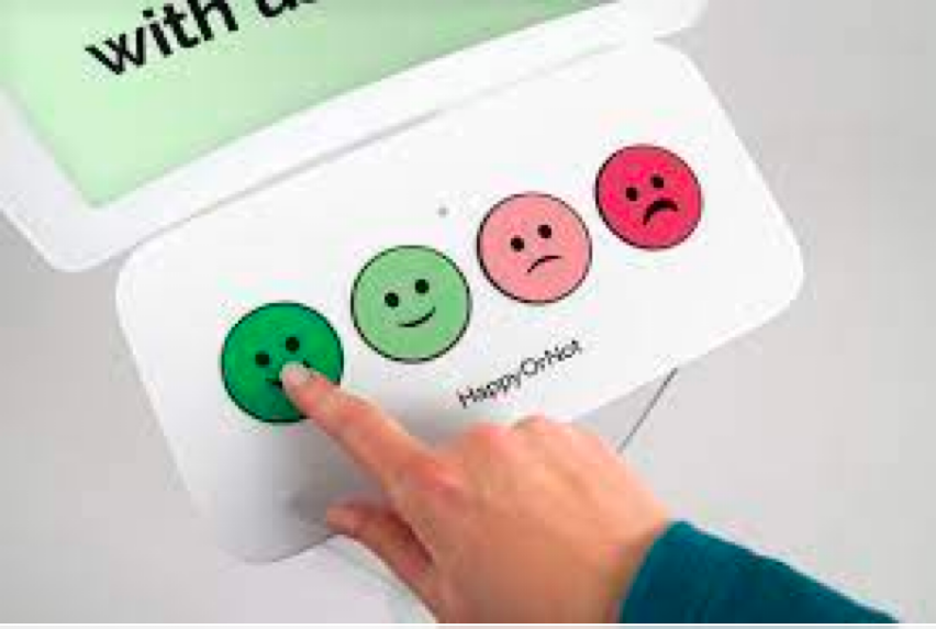
Post-pandemic subway station ratings had been at an all-time low; often resulting in negative press for the MTA. Executive management wanted to learn more from riders on what issues mattered most. Their goal was to develop an app based on the common happy, average, sad face feedback common in retail environments.
Management was looking to have a similar solution deployed to the five worst-performing stations in the NYC Subway system. We had some doubts on this one.
Why the Brief Was Wrong
The Reality of the Situation
- The MTA already suffers from high levels of vandalism. We doubt a happy face would last more than a day in this environment.
- Crime and safety top the list of rider's concerns; yet they all fall under NYPD's jurisdiction, out of MTA's control.
- Subway platforms are crowded, loud, and often chaotic. Voice calls for help are almost impossible.
- NYPD needs detail in order to act, but very difficult in a hectic/dangerous environment.
- Riders just want to get above ground ASAP.
Our Proposal
Making a Difference in Three Simple Steps
The proposal transforms the survey concept into a more direct, action-oriented tool. Rather than asking "How do you feel?", we position the solution as "Help us make a difference", acknowledging the need for improvement while engaging riders.
This is a two-part solution, starting with key signage designed to engage the public with powerful messaging, and a call to action for our reporting app. We focused on major issues based on research, all formatted in an easy-to-use, one-hand operation.
Step One
Engaging the Rider
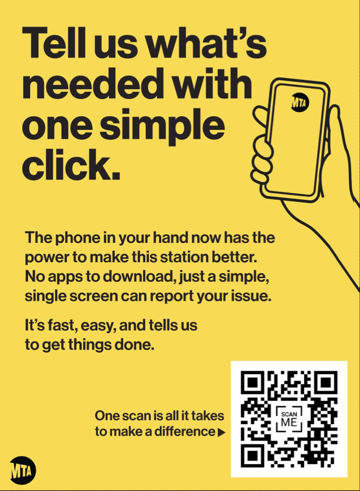
Simple, powerful signage that cuts through the clutter of a busy station while getting riders engaged to make a difference. This is by far the biggest challenge, and essential for positive results.
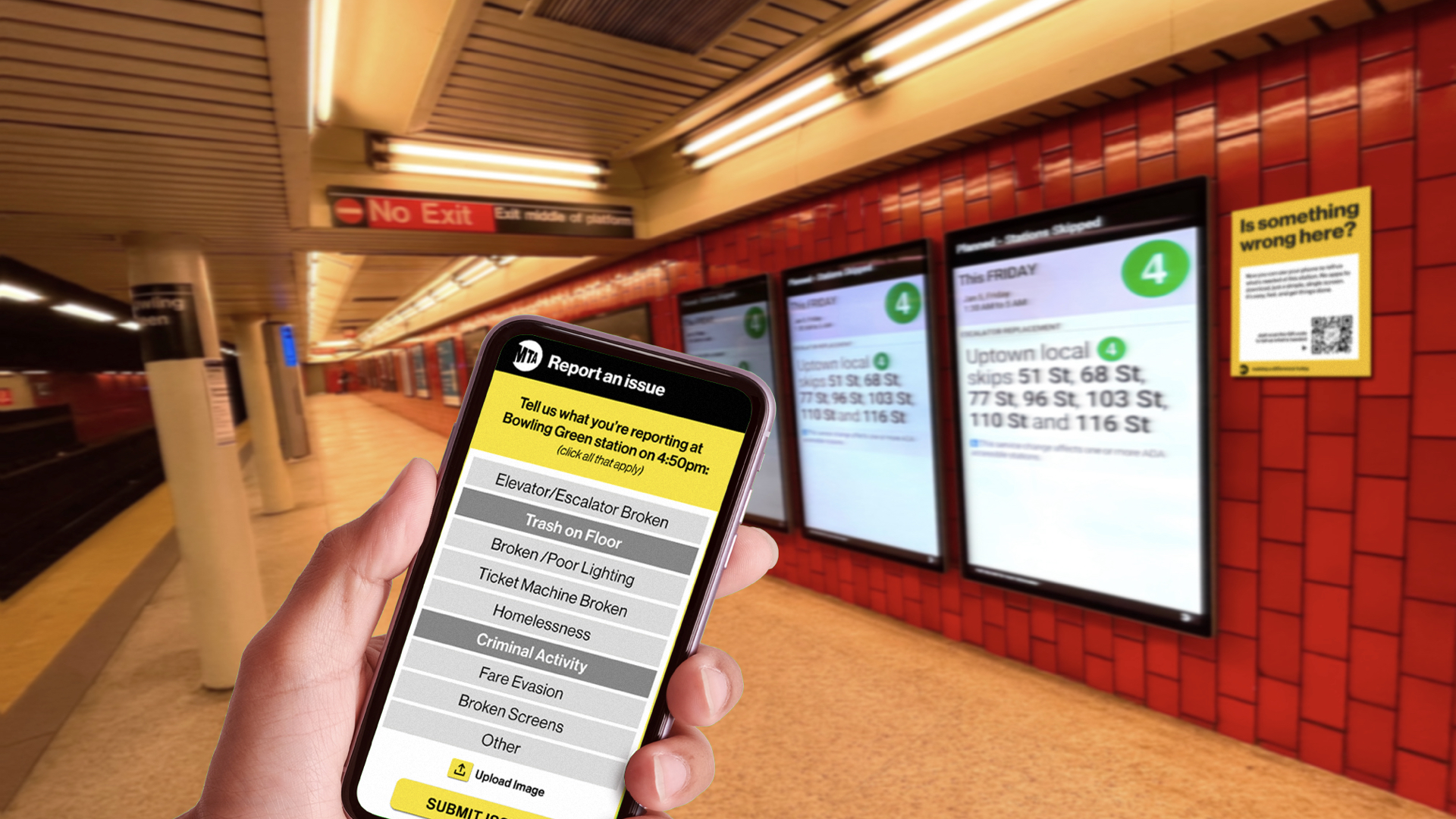
We developed three different signs for the pilot to reduce repetition, an issue with public signage, while purposely using bold, to-the-point messaging to address this station's real-world issues.
Step Two
Tell Us What's Wrong
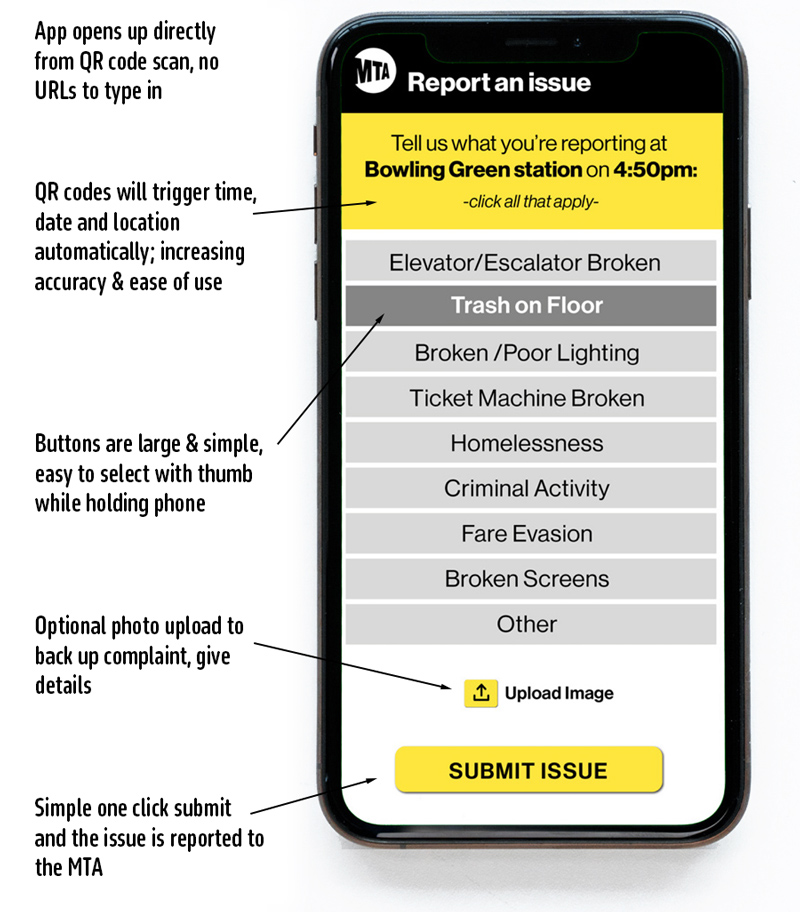
Our research revealed the top issues that concern riders at the worst stations, so we made the selections simple and easy. The interface is large with all actions accessible by a single hand/thumb.
We also give users the option of uploading a photo to further engagement while helping MTA staff pinpoint the issue. Made optional out of rider safety concerns when reporting people's activity.
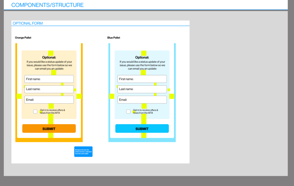
Optional
More Detail
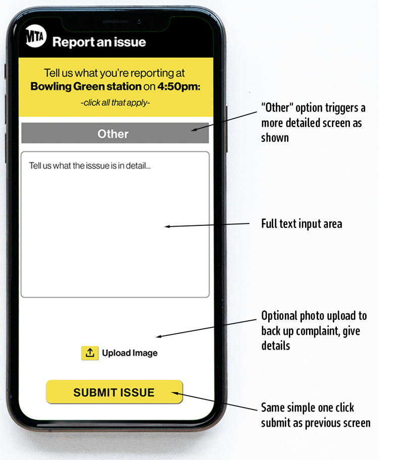
It would be rather disingenuous to think that 7.8 million riders would only have 8 issues to report. As such, we have the option to manually add an issue.
Step Three
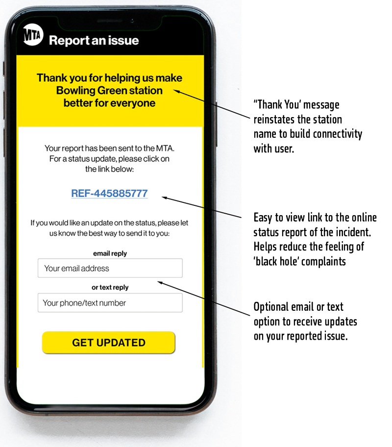
Submit and Get Updated
That's it, a few simple clicks to make a difference in one's commute or travels.
To add additional engagement, we not only summarize the location, but link the user to an active ticket where they can see this as an action item. Users can also opt to receive text or email updates on their status, a new level of transparency that shows we take major issues seriously.
Full Screen Set
The Complete Experience
What Followed
Success Led to More Versions
As word got out within the MTA, more agencies came to us for their own versions. Since the original prototype, we have designed and developed four more versions:
- Long Island Railroad station maintenance app
- Metro North Railroad in-car bathroom reporting app
- NYC Transit Subway in-car reporting app
- NYC Subway emergency message to 911 app
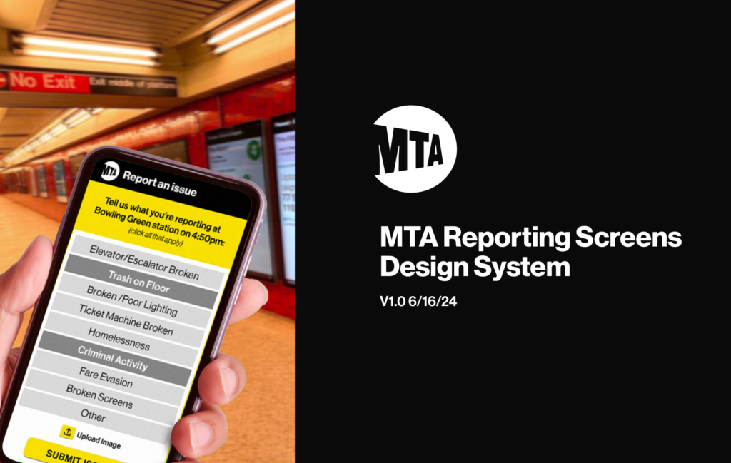
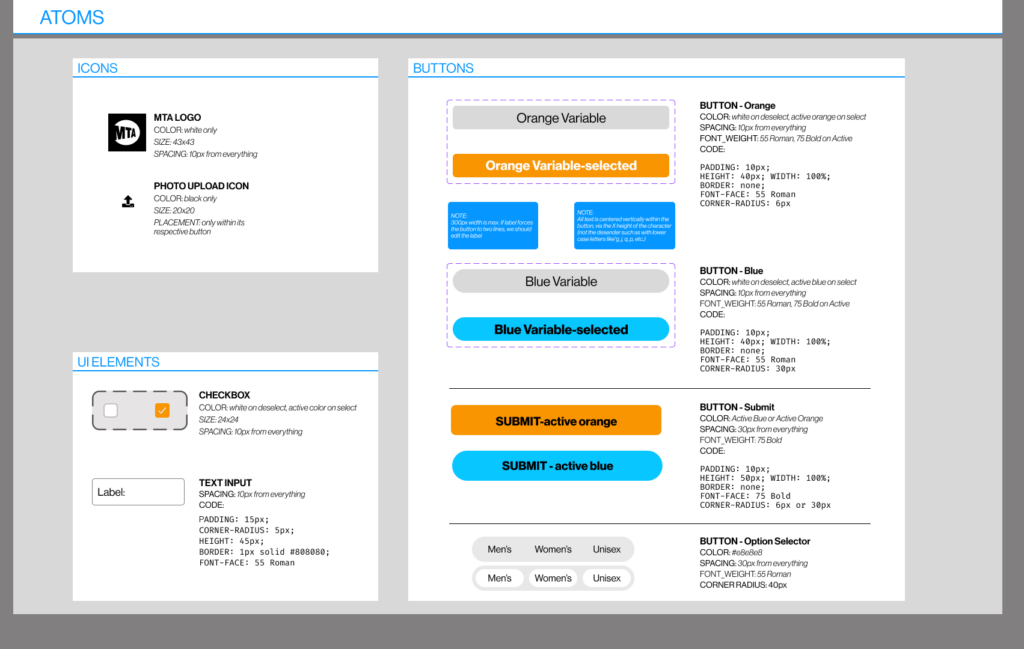
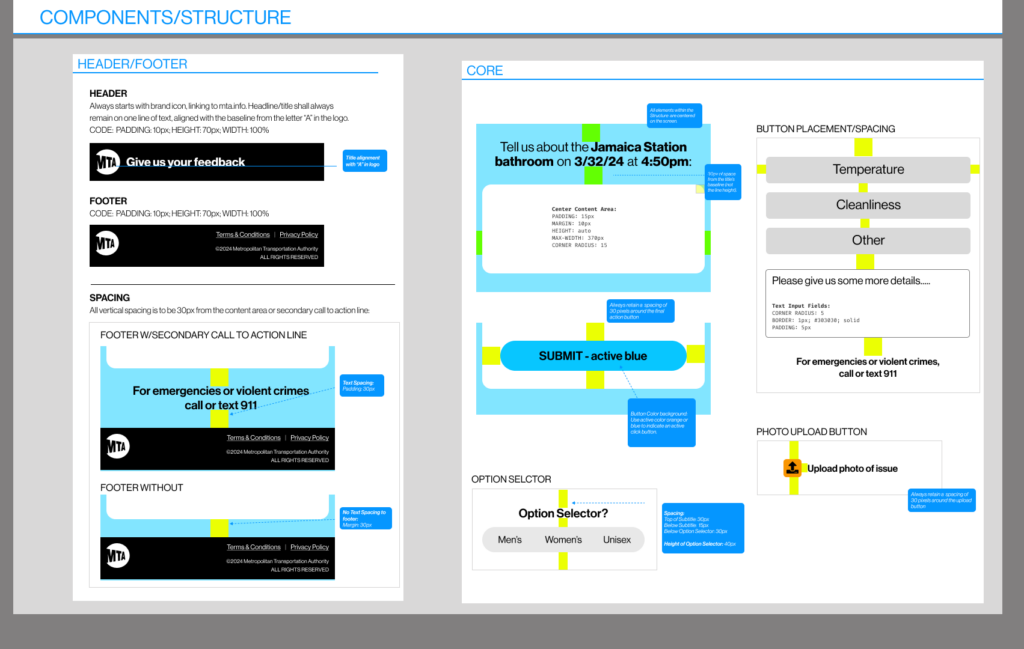
Design System
472 Stations. One System.
The reporting tool's success across NYC Transit led to immediate demand from Long Island Railroad and Metro North, two of the MTA's largest divisions. Expanding across three agencies with distinct operational needs was no small task. The design system made it possible.
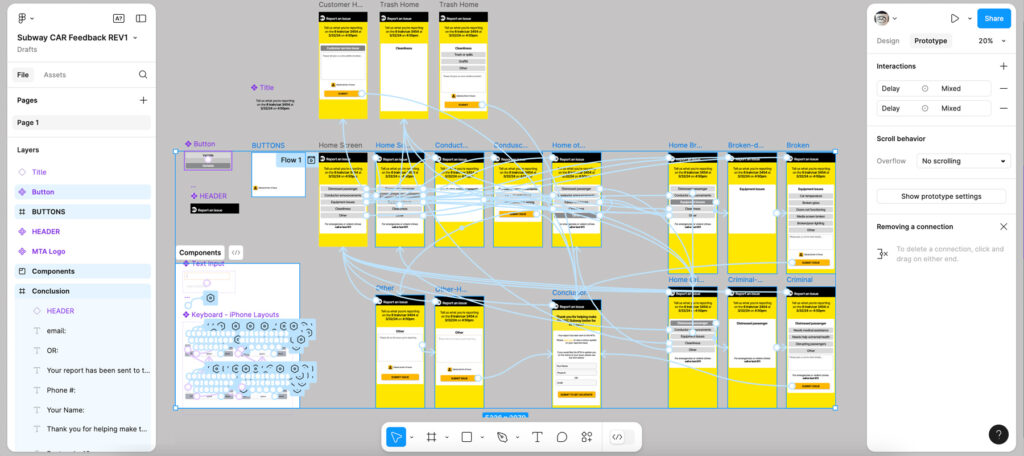
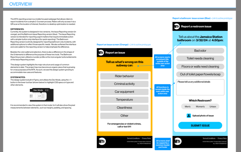
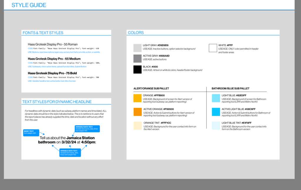
Built as a modular component library, the system gives engineering teams everything they need to adapt the tool for new report types, new agencies, and new environments without reinventing the design from scratch. Typography, color, interaction patterns, accessibility standards, and component specs are all documented and ready to implement. The result: consistent design quality and usability across every version, every agency, every station.
Content
Copy for the Hardest Environment
Developed the concept and wrote all signage copy. NYC subway platforms are notoriously crowded, hectic, and stressful, and signage there has to do something almost contradictory: cut through visual chaos and appeal to a rider's better instincts to participate. A very tall bar. Every word was tested against that standard.
A feedback system built for the real subway environment, not an idealized version of it. Three simple steps. Any station. 472 locations waiting.
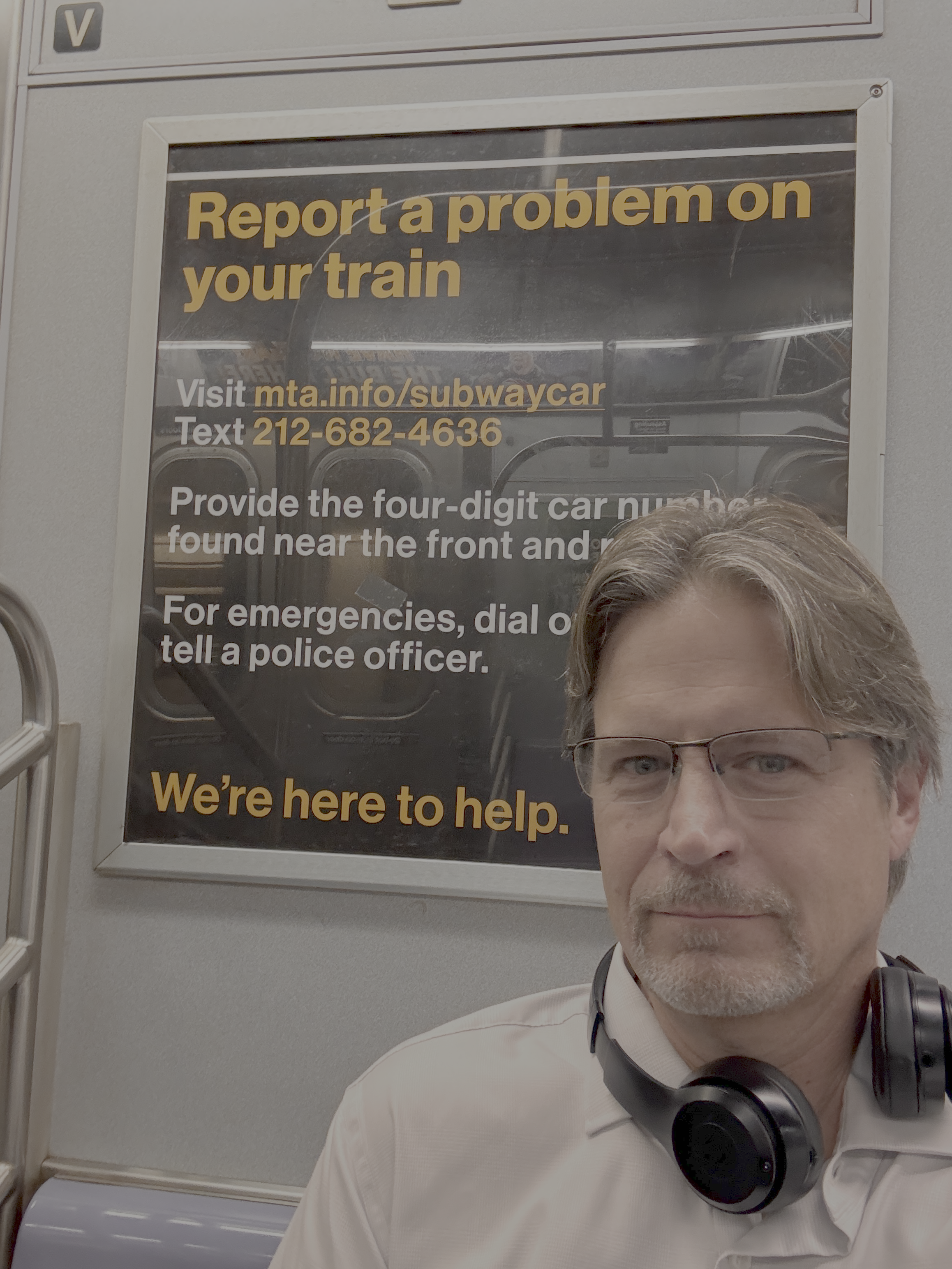
there's something quite satisfying when seeing your work in action every day.